collection seven, furniture guide, interior design
Creating a Neutral Colour Palette in Your Living Room
Building a Neutral Palette That Feels Rich, Not Empty
The neutral living room is one of the most pursued and most frequently misunderstood aspirations in British interior design. The rooms that do it well are among the most beautiful and enduring interiors being made today — rooms with a quiet confidence, a material richness and a quality of composed calm that more colourful schemes rarely achieve with the same consistency. The rooms that attempt it poorly look flat, characterless and unresolved.
The difference between these outcomes is almost never about the specific neutrals chosen. It is about how those neutrals are assembled — the tonal relationships between them, the material contrasts within the palette, the awareness of how light will move across different surfaces throughout the day. A neutral palette is not an absence of decision-making. It is decision-making conducted at a subtler frequency, where the choices are harder to articulate but no less consequential.
This guide is about how to build a neutral living room palette that feels genuinely rich — one that rewards living in as much as it rewards looking at.
Understanding Warm and Cool Within the Neutral Range
The single most important distinction within the neutral palette is between warm and cool. Neutrals are not colourless — they all have undertones that pull them toward warmth (yellow, orange, red) or coolness (blue, green, grey). Understanding which end of this spectrum your room occupies is the foundation of building a coherent neutral palette.
Warm neutrals — ivory, oatmeal, bamboo, parchment, butter, ecru — have a golden or creamy quality that reads as welcoming and organic. They suit rooms with natural timber floors, warm-toned stone, jute or wool rugs, and abundant natural light. They are forgiving of imperfect light conditions because they bring their own warmth to contexts where the light does not supply it.
Cool neutrals — chalk, canvas, cotton, stone, pale grey — have a cleaner, crisper quality that reads as contemporary and refined. They suit rooms with paler stone floors, polished or lacquered surfaces, white or cool-grey walls, and rooms with very clear, direct natural light. In lower-light conditions or rooms with warm-toned architectural elements, cool neutrals can read as slightly flat or clinical.
Most successful neutral living rooms work within one end of this spectrum rather than trying to bridge both. A palette that mixes very warm and very cool neutrals without a unifying element tends to feel incoherent — the eye senses that something is slightly off without being able to identify it. Choosing a direction — warm or cool — and staying within it is the first and most important palette decision.
The Anchor Tone: Starting With the Floor
The floor is usually the right starting point for building a neutral palette. It is the largest single surface in the room, it is fixed, and it establishes the room's fundamental tonal register. Everything else should be chosen in relationship to it.
A natural oak or warm timber floor anchors the palette firmly in the warm neutral range. A pale limestone, polished concrete or bleached timber floor anchors it in the cooler range. A natural fibre floor covering — jute, sisal, seagrass — is warm in tone and texture, providing an organic anchor that suits fabric-rich, layered schemes. Understanding what the floor is contributing to the palette allows you to build from a clear starting point rather than making choices in isolation.
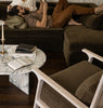
The Sofa: The Primary Palette Statement
In most living rooms, the sofa is the largest upholstered surface and therefore the most significant palette decision. The sofa fabric establishes the primary material tone of the room — the quality and temperature of neutral from which everything else is read.
For Warm Neutral Schemes
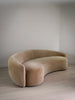
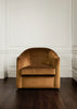
The most effective sofa fabrics for warm neutral schemes are those that share the warmth of the floor and architectural context while contributing their own material richness. Ecru and ivory boucle are consistently strong choices — their looped surface creates visual depth and warmth without committing to a strong tone. Oatmeal mohair velvet is the richest option — its lustre and depth make it one of the most beautiful sofa fabrics available within the warm neutral range.
The Golborne Sofa in ecru boucle is a particularly well-resolved combination within this palette. The curved form and the textured fabric create a piece of genuine warmth and presence that anchors a warm neutral scheme without dominating it.
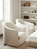
For Cool Neutral Schemes
In a cooler neutral scheme, linen is generally the stronger foundation fabric. Chalk linen and canvas cloud linen are among the most reliable choices — their flat, matte weave and restrained tone provide a quiet, precise foundation that suits rooms with a more architectural, minimal quality. The Courtnell Sofa in chalk linen or macadamia cloud linen creates exactly this kind of composed, restrained starting point.
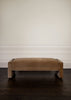
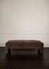
Building the Secondary Layer: Chairs and Ottomans
Once the sofa fabric is established, the secondary layer — lounge chairs, ottomans, benches — introduces tonal variation within the palette. The goal is not to match the sofa but to extend the palette — to add tones that are related but distinct, creating depth without disrupting coherence.
In a warm neutral scheme built on an ecru boucle sofa, the secondary layer might include a chair in fallow velvet (slightly deeper, more saturated, still warm), an ottoman in bamboo linen (warmer still, flat rather than textured), and a bench in ivory boucle (lighter, sharing the sofa's material quality). Each piece is related to the others through tone and temperature, but each has its own character — the palette is unified but not uniform.
The Talbot Chair serves this secondary layer role with exceptional versatility, its extensive fabric range allowing it to be specified in almost any tone within the warm or cool neutral palette. In sandcastle velvet alongside an ivory boucle sofa, it creates tonal depth without disruption. In oatmeal mohair velvet alongside a chalk linen sofa, it introduces warmth into a cooler scheme without overwhelming it.
The Role of Wood Finishes in the Neutral Palette
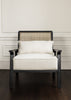
In pieces with visible wooden frames, the stain finish is a palette decision. Bleached oak contributes a warm, pale, organic note — it reads as a natural material rather than a statement, which suits neutral schemes built on organic, natural elements. White wash is similar but slightly cooler. Walnut look brings a deeper warmth that grounds paler upholstery and creates a quality of anchoring richness within the scheme. Black creates the strongest contrast and introduces a graphic quality — it works well in neutral schemes where some crisp definition is wanted alongside the softness of the upholstery.
The frame stain decisions across multiple pieces in the same room should be considered together. Mixing very different stain tones — bleached oak and walnut look, for instance — can work as deliberate contrast but tends to look unresolved when it is the result of unrelated choices rather than a considered decision.
Introducing Interest Without Breaking the Palette
One of the challenges of a strictly neutral palette is preventing it from feeling safe to the point of blandness. The antidote is material depth and textural contrast rather than colour — but there are also moments where a single considered departure from the neutral register can give a room its character.
A single piece in a pattern fabric — a Holland Chair in the autumn tapestry pattern, or a Blenheim Bench in the tiger print — introduces warmth and visual interest within an otherwise neutral scheme in a contained and deliberate way. The pattern reads as a considered accent rather than a disruption because everything around it remains quiet. This is the most sophisticated way to use pattern in a neutral interior: a single note of complexity within a composed neutral context creates a room with a point of view rather than a room that is simply being careful.
Explore the full Collection Seven range to understand how the pieces and fabrics work together within a coherent palette, and order swatches to build your palette in your specific room conditions.