collection seven, furniture guide, interior design
Layering Textures in Interior Design
Why Texture Does More Work Than Colour in Most Rooms
In the best British interiors — the ones that reward sustained looking and feel genuinely alive to be in — texture often does the work that colour might do in a more chromatic scheme. The difference between a neutral room that feels considered and one that feels merely beige is almost always textural. Multiple surfaces with different material qualities: smooth and rough, matte and lustrous, open-woven and dense — these contrasts create the visual interest and depth that colour provides in more committed palettes.
For those working in the neutral register that dominates British interior design at the moment, understanding how to layer textures is not a supplementary skill. It is the foundational one. Without it, the neutral room is flat. With it, the same palette becomes rich, dimensional and genuinely beautiful.
This guide examines how to layer textures effectively across an interior, with particular attention to the role that upholstered furniture plays in creating material depth.
Understanding Texture in Three Categories
A useful framework for thinking about texture in an interior is to organise surfaces into three broad categories: smooth and reflective, matte and flat, and textured and complex. A room that includes all three in appropriate proportions will feel balanced and complete. A room dominated by any single category will feel monotonous — too much smooth and reflective feels cold; too much matte and flat feels dull; too much texture feels busy and unresolved.
Smooth and Reflective
Smooth, reflective surfaces include polished timber floors, glazed ceramics, lacquered furniture, glass, polished stone and metallic finishes. These surfaces catch and redirect light, creating a sense of brightness and precision. They are important in an interior because they prevent the room from becoming visually heavy — without some reflective surfaces, a room can feel absorbed and dense regardless of how pale its palette is.
In a furniture context, the smooth surfaces tend to come from hard elements: the lacquered or polished leg of a chair or ottoman, a metal side table, a glass vase. They rarely come from the upholstery itself, which is why upholstery choices sit primarily in the other two categories.
Matte and Flat
Matte, flat surfaces — painted walls, plain linen upholstery, natural stone, unpolished timber — provide calm and a sense of visual quietness. They are the backdrop against which other textures read. An interior without sufficient matte, flat surfaces tends to feel restless and over-stimulated.
In upholstery terms, linen is the primary representative of this category. Its flat, matte weave creates a quiet, recessive surface that contributes to the room's sense of calm rather than demanding attention. This is why linen is such a reliable foundation fabric — it provides the matte ground that allows more textured or more lustrous surfaces elsewhere to read clearly.
Textured and Complex
Textured surfaces — boucle, velvet, rough plaster, natural stone, woven textiles, shearling — create visual and tactile complexity that makes a room feel alive and inhabited. These are the surfaces that reward proximity and touch; they reveal more the closer you get to them. In an interior context, they are the surfaces that create warmth, interest and the sense of material richness that distinguishes a well-furnished room from a merely decorated one.
The balance of textured surfaces against flat ones is perhaps the most important compositional decision in layering textures. A room with too many textured surfaces feels busy and cluttered. A room with too few feels sterile. The traditional ratio — roughly one part texture to two parts flat, with some reflective surfaces throughout — works as a starting point, though the specific proportions depend on the particular surfaces and the room's scale and light conditions.
Starting With the Upholstered Pieces
In most living rooms, the upholstered furniture is where the material layering begins. The sofa establishes the primary textural tone; the chairs, ottoman and bench extend and complicate it.
Sofa as Foundation
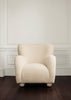
The sofa's fabric sets the primary material register of the room. A sofa in chalk linen sets a matte, flat register — warm and quiet. A sofa in ivory boucle sets a textured, complex register — warm and richly surfaced. A sofa in oatmeal mohair velvet sets a lustrous, deep register — warm and luxurious. Each choice creates a different kind of foundation, and the layering that follows should respond to that foundation.
A linen sofa foundation — quiet and flat — calls for more textured pieces around it to create depth. A boucle sofa — already textured — calls for some flatter, quieter pieces alongside it to provide contrast and prevent the room from feeling uniformly textured. A mohair velvet sofa — lustrous and rich — calls for matte, quiet pieces that give the velvet the space its surface quality deserves.
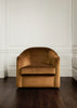
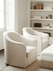
Chair as Contrast
The lounge chair is the most important opportunity for textural contrast within a seating arrangement. The most effective material combinations pair fabrics from different textural categories: a linen sofa with a velvet chair; a boucle sofa with a linen or faux shearling chair; a velvet sofa with a boucle or linen chair.
The Pembridge Chair in natural faux shearling alongside a chalk linen sofa creates one of the stronger textural contrasts available in the range — the deep, soft pile of the shearling against the flat, crisp weave of the linen. The contrast is immediate and effective, giving the arrangement a material richness that a second linen piece could not create.
The Talbot Chair in sandcastle or fallow velvet alongside an ivory boucle sofa creates a more subtle contrast — the directional pile of the velvet against the looped surface of the boucle. Both fabrics are warm neutrals within a similar tonal range, but their surface qualities are entirely different: one absorbs light, the other loops and reflects it. This kind of contrast — tonal similarity with material distinction — is one of the most sophisticated and most rewarding approaches to textural layering.
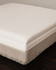
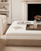
The Ottoman as a Material Bridge
The ottoman, positioned at the centre of the seating arrangement, is in visual relationship with both the sofa and the chairs. It is therefore an ideal position for a material that bridges or mediates between the other fabrics in the scheme.
A linen ottoman between a boucle sofa and a velvet chair creates a matte, quiet middle element that allows both the boucle and the velvet to read clearly without competing. The Bridstow Ottoman in ivory or walnut linen serves this bridging function very effectively, its flat surface providing a quiet counterpoint to more textured pieces on either side of it. The fringe detail at the base adds a subtle textural note without interrupting the overall quietness of the piece.
Hard and Soft in Dialogue
The most sophisticated interiors are those where hard and soft surfaces are in continuous conversation throughout. The visible wooden legs of a lounge chair against a boucle seat; the polished stone of a fireplace surround beside a mohair velvet sofa; the smooth oak of a side table surface against a linen ottoman; the rough texture of a natural fibre rug beneath smooth-legged furniture. These contrasts are not accidental in well-designed rooms — they are the material language of a considered interior, produced by an awareness of how different surfaces read in proximity to each other.
The wood stain choices available on Collection Seven pieces with visible frames — bleached oak, white wash, walnut look and black — are part of this dialogue. Bleached oak alongside pale boucle or linen creates a warm, organic combination. Black legs against cream or ivory upholstery creates a crisp, contemporary contrast. The choice of frame stain is a textural decision as much as a colour one: it determines what the hard structural element of the piece contributes to the material conversation of the arrangement.
Scale of Texture
The scale at which texture operates matters as much as the type. A fine-woven linen and a coarse, heavily textured boucle read differently not just in tactile quality but in the visual weight they carry and the scale at which they register. Very coarse or heavily textured fabrics — deep-pile shearlings, heavily looped boucles — work best as accents rather than as the dominant surface across all the upholstery in a room. Restraint in the use of strong textures, as in the use of strong colours, produces more sophisticated results than abundance. One piece in a strongly textured fabric — a faux shearling chair, a patterned bench — reads as a considered accent. Multiple pieces in strongly textured fabrics creates visual noise rather than richness.
Explore the full Collection Seven range with this layering approach in mind, and order fabric swatches to assess how different materials sit together in your specific room before making final decisions.