collection seven, furniture guide, interior design
How to Choose the Right Sofa Colour
Colour Is Context — Not a Choice Made in Isolation
A sofa colour that reads beautifully in a showroom can look entirely wrong once it arrives in your home. This is not an illusion or a trick of lighting — it is a genuine and predictable consequence of context. Every fabric colour is affected by the specific light conditions of the room it occupies, by the other materials and colours around it, and by the changing quality of light across different times of day and different seasons. A colour chosen without accounting for these factors is a colour chosen incompletely.
This is why choosing a sofa colour is one of the most consequential decisions in furnishing a room, and one that benefits enormously from a methodical rather than instinctive approach. The instinct to choose what looks good on screen or in a showroom is understandable — but it is consistently less reliable than the process of assessing actual fabric samples in your actual room, at different times of day, alongside your existing materials.
This guide sets out that process, and provides specific guidance on the Collection Seven palette and how different tones perform in different room conditions.
Step One: Understand the Light in Your Room
Before looking at any specific sofa colour, assess the quality, direction and character of the light in your room. This is the single most important contextual factor for any fabric choice.
The Direction Question
Which direction do your living room windows face? This is the starting point for understanding your room's light conditions. South-facing rooms receive warm, strong, direct sunlight for much of the day — fabrics appear brighter and more saturated in this light, and pale fabrics will be particularly radiant. North-facing rooms receive cool, indirect light throughout the day — warm fabrics help compensate for this coolness, and pale fabrics can read as flat or slightly cold. East-facing rooms are bright in the morning and cooler in the afternoon; west-facing rooms have warm, golden afternoon and evening light that makes fabrics appear particularly rich and warm.
The Quality Question
Beyond direction, consider the quality of the light. A room with large windows and an unobstructed aspect receives generous, clear light. A room with small windows, or one overlooked by nearby buildings or trees, receives limited or filtered light. In rooms with limited natural light, fabric colour choices need to account for the fact that the sofa will often be seen primarily under artificial lighting — which has a very different character from natural light and tends to warm all tones.
Step Two: Understand Undertones
Every fabric colour has an undertone — a secondary hue that becomes visible under certain light conditions and in relationship with certain other colours. Undertones are the most common source of colour mistakes in interior design: two fabrics that appear similar in isolation can look quite different when placed alongside each other or viewed under different light conditions, because their undertones are pulling in different directions.
In the Collection Seven palette, the undertone differences between fabrics that appear superficially similar are often significant. Chalk linen and cream linen, for instance, appear very close in overall tone but have distinct undertones — chalk is relatively neutral, making it one of the more reliable choices across different light conditions; cream has a slightly warmer, more yellow undertone that reads beautifully in south and west-facing rooms but can feel slightly cloying in north-facing ones.
Similarly, ivory boucle has a warm, slightly golden undertone that makes it one of the most welcoming fabrics in any light condition. Ecru boucle is slightly cooler and more neutral. Oyster boucle has a subtle greenish-grey undertone that suits rooms with a cooler, more mineral palette. These differences are subtle but cumulative — they determine whether a fabric feels right in a specific room or slightly off.
Step Three: Build a Palette Relationship
A sofa colour should not be chosen in isolation from the rest of the room. It must be considered in relationship to the floor, the walls, the window treatments, and any other significant fixed or semi-fixed elements. The sofa colour should sit within the room's overall palette — reinforcing it, extending it, or providing a considered counterpoint to it — rather than competing with it or ignoring it.
Warm Rooms
Rooms built on warm, organic tones — timber floors, jute or wool rugs, cream walls, natural materials — call for sofa fabrics within the warm neutral range. Bamboo linen, parchment linen, butter linen, oatmeal mohair velvet, ivory boucle, ecru boucle: these fabrics share the warmth of their surrounding context and create a room that feels coherent and settled. A cool-toned fabric in a warm room will always feel slightly wrong — the eye senses the disconnect even if it cannot articulate it.
Cool Rooms
Rooms with a cooler palette — stone floors, white or cool-grey walls, minimal architectural detail, polished or glass surfaces — are better served by fabrics within the cooler neutral range. Chalk linen, canvas cloud linen, cotton cloud linen, smoke mohair velvet: these fabrics share the restraint and precision of their context. A very warm fabric in a cool room can feel incongruous — an intrusion of a different temperature and register that the room has not prepared for.
Mixed Contexts
Many rooms are neither purely warm nor purely cool — they have elements of both, and the sofa colour must navigate between them. In these situations, fabrics with minimal undertones are the safest choice: chalk linen, macadamia cloud linen, and canvas cloud linen are among the most reliably neutral fabrics in the range, reading comfortably across different light conditions and alongside different palette temperatures.
Specific Colour Recommendations by Context
For Light, Neutral Rooms
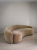
The palest fabrics — chalk linen, cream linen, ivory boucle, ecru boucle — work exceptionally well in rooms where the priority is to keep the space feeling open and light. The Courtnell Sofa in chalk linen or canvas cloud linen is one of the most composed and elegant combinations in this register — the clean silhouette and the quiet fabric create a sofa that belongs to the room without dominating it.
For Warm, Layered Rooms
Bamboo linen, parchment linen, terra linen and truffle linen sit beautifully in rooms that have warmth and material richness in their palette. The Beaufort Sofa in bamboo linen has a settled, organic quality that suits rooms with timber, stone and natural textiles. The Albion Sofa in parchment linen has a similar warmth with a slightly more refined, tailored quality.
For Material Richness Without Strong Colour
Oatmeal mohair velvet, dune mohair velvet and fallow velvet are fabrics that add significant material depth and richness to a room without committing to a strong colour. They sit within the warm neutral range but have a luminous, textured quality that plain linens and boucles do not possess. The Golborne Sofa in oatmeal mohair velvet is a particularly compelling example — the curved form and the lustrous pile create a piece of considerable presence that reads as richly furnished without introducing colour.
For a Deeper, More Grounding Note
Espresso linen, walnut linen, sepia velvet, carob velvet and chocolate velvet are deeper tones that anchor a room and create a quality of warmth and groundedness that paler fabrics cannot provide. These work best when the surrounding palette is relatively restrained — pale walls, light floors, minimal pattern — so that the sofa has the space to read without the room feeling heavy. A Clarendon Sofa in espresso linen in a pale, well-lit room is a quietly dramatic combination that rewards the deliberateness of the choice.
The Essential Step: Order Swatches
Everything in this guide is preparatory. The actual decision — the one you can rely on — comes from placing fabric swatches in your room and assessing them in your specific conditions. At different times of day. Alongside your floor. Against your wall colour. In natural light and in lamp light.
Fabric swatches are available from the Collection Seven store at £3 each. Order the three or four fabrics you are seriously considering. Live with them in the room for a few days. The right choice will declare itself clearly — and the wrong choices will become equally obvious, in a way that no amount of screen-based research can replicate. The fifteen minutes you spend comparing swatches in your room will be the most productive fifteen minutes of the entire buying process.